Dec 13, 2012
As I have mentioned before, Apple has done some things to shaken my loyalty. I am at the point where my next phone will not be an automatic iPhone purchase. I have friends and colleagues pitching alternatives pretty hard. Out of curiosity, I looked up the availability of my favorite mobile apps on the Windows and Google App Stores. Here is what I found.
App |
Android |
Windows Phone |
|---|
Any Password Manager
(like 1Password) |
Yes: LastPass |
Yes: LastPass |
Evernote |
Yes |
Yes |
Google+ |
Yes (duh) |
No (duh) |
Kindle |
Yes |
Yes |
Any Exercise GPS
(like Garmen) |
Yes: RunKeeper |
Yes: Mobifit |
Mint |
Yes |
No |
Movies
(by Flixster) |
Yes |
Yes |
Pocket
(or InstaPaper)
|
Yes |
Yes: MetroPaper |
RememberTheMilk |
Yes |
Yes: Milkman |
RSS Reader
(with Google Reader Support) |
Yes: Google Reader |
Yes: nextgen Reader |
ServerDensity |
Yes |
No |
Any SSH Client |
Yes: lots |
Yes: Token2Shell |
Tripit |
Yes |
Yes |
Twitter |
Yes |
Yes |
Yelp |
Yes |
Yes |
YouTube |
Yes (duh) |
Yes |
Overall, I was surprised by the number of apps on the Windows Phone store. The screen shots looked really nice too. However, I think that the combination of Mac + Windows Phone would be challenging. If I was a Windows user, the Windows Phone would be a pretty attractive option.
One thing that I find limiting on the iPhone is that Safari is locked down and doesn't accept plugins. I assume that Android doesn't have this issue because it gives you different browser options. Does Windows allow you to install mobile IE plugins/extensions?
Jul 12, 2012
Now that I sorted out this site's mobile problems, I feel authorized to complain about mobile issues on other sites. Here are my top four pet peeves.
Aggressive App Promotion
You go to a site and get blocked by a dialog box that encourages you to download their app. When I click on a link or type a URL, I am sending a pretty clear signal that I want the content that is on the other end. I am not looking for another app to install.
If you want to promote your app, use a banner ad slot to make a subtle suggestion. Don't put up an interstitial that breaks the flow. A few sites do this nicely by putting a small floating tab on the bottom right of the page.
Dialog Boxes
Speaking of dialog boxes, don't put them on your mobile website at all. If you feel like you need a dialog box, make sure to design it for mobile by making the buttons extra big. Those tiny x's in the corners just don't cut it.
Flash
The writing has been on the wall for a long time now and, now with Android Jelly Bean dropping Flash support, there is no denying it. Flash is dead on mobile. Don't use it — especially if your site is for a restaurant or any other destination for people on the go.
Disjointed Mobile/Full Experience
If your content is any good, it will be shared between users on all sorts of platforms. Someone might first encounter the content on a mobile device and then want to continue reading on the full experience. To facilitate this, make it easy for a user to jump between content views.
Jul 09, 2012
Astute observers of this blog have probably noticed that I redesigned the site. Being someone who agrees with Lou Rosenfeld when he says Redesign Must Die, this wasn't as capricious a decision as it may seem.
So why the redesign? Two reasons really. First, since joining Lionbridge this site is no longer for selling consulting services. It has gone back to its roots as a blog. I wanted to move away from the Content Here, Inc. company branding and get it back to a personal blog. Second, and more importantly, I wanted to experiment with adaptive design. Over the past year, a growing proportion of my traffic has been from non-desktop devices (phones and tablets). Reading the site was rough on a little screen. And that plays into a larger philosophy of minimalism — keeping as little as possible between the reader and the content.
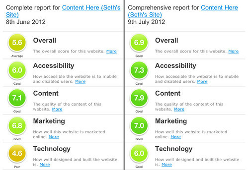
As an experiment, I downloaded a very basic theme (Backbone) and didn't customize the code at all. I just played with the configuration options. I also benchmarked the site using Sitebeam, which applies 40 tests. After a bit of tweaking, I was able to increase my total score from 5.6 to 6.9 out of 10. The greatest improvements were in accessibility (from 6.0 to 7.3) and technology (4.6 to 6.0). There were also improvements in the content and marketing categories (see screenshot).
It remains to be seen if these scores reflect real usability and utility improvements. Anecdotally, I think the mobile version is much better. The content stands out and is easy to read. That was the result that I was going for. More importantly, I want to hear from you. Please provide feedback in the comments, Twitter (@sggottlieb), or Google Plus.
Jun 09, 2011
Mobile publishing functionality is becoming an increasingly important requirement for web content management (WCM) selections and I am starting to hear more customers ask "can this product do mobile?" The fact is, most WCMS have that core functionality built into their DNA since multi-format publishing has been going on since the beginning of time. In the early days it was publishing "printer friendly" versions, PDFs, portlets, or RSS (we only dreamed of mobile). Now we are talking layouts and navigation that are optimized for smaller screens. In fact, what differentiates a WCMS from a document management system is the "rendering" or "presentation" tier that takes structured content and applies a layout template to generate a formatted output. The specific purpose of the rendering tier is to be able to reuse content and publish to different formats.
Just because nearly all WCMSs have the foundation to support a decent experience for a mobile user, it doesn't mean mobile will come easily to your solution. Why? Because WCMSs are also very flexible and give you plenty of opportunity to shoot yourself in the foot. WCMSs allow you to model your content with enough structure to make it reusable, but they don't require it. You can still use a single generic content type and turn your WCMS into a 6 million dollar WYSIWYG editor. You can fail to keep your content DRY. If you committed these sins, your mobile project is when they will come home to roost.
While structured, reusable content is a key to success in mobile and nearly all WCMSs support some degree of content modeling, there are a few non-universal features that will make supporting mobile easier. Look out for these features when evaluating WCMSs.
-
Configurable template selection rules. All WCMS should be able to associate presentation templates to content types. You should look for a platform that allows you to configure template selection rules based on criteria like the section of the site or the user agent (browser). Otherwise, you need to build complex switching logic into your display templates.
-
Themes. A theme is a collection of templates that define a comprehensive style (layouts, behavior, font, palette, images, etc.) of the site. A theming model allows you to group templates that are used for a style. This makes themes interchangeable and selectable so you can manage a mobile theme (or multiple mobile themes for different devices). It is particularly helpful if the platform allows themes to override each other — similar to cascading style sheets. For example, you could have a base theme and specific themes that override selective elements of the base theme.
-
Multi-site content sharing. Designing for mobile is not limited to layouts and styling. There is growing consensus around the value of having a separate site with content that mobile visitors are likely to want. This doesn't have to be fresh, mobile-only content. Rather, it is a subset of the main content with a simplified navigation. Some WCMSs will represent this mobile area as a different "site." Others will represent it as a folder in the hierarchy. Regardless of the semantics, you need to be able to have the same piece of content exist in both of those places at once. Different WCMSs use different metaphors to allow contributors to manage these placements: "locations," "aliases," "references." Some metaphors come more easily to contributors than others but all contributors need training to get it right.
True preview. Editors will want to see how the content is going to look on different devices before publishing. Some WCMS come with emulators that allow you to see a page as if it being accessed by a mobile device. I don't know how accurate these emulators are but they are probably good enough. If the WCMS does not have an emulator, you need some way to access that preview from another device. This can be complicated if the preview is not behind a readily accessible URL that you can point the device to. Some WCMS run preview off of the user's session data (the draft is not stored in the repository until it is deliberately saved). This will be a problem because mobile testing device will be in a different session. Some WCMS architectures (mainly baking-style systems) have a full site staging area. This makes it easier to run through a whole site of pre-published content from your mobile device.
Those are the key CMS features to look for. The rest is in the execution. In addition to content modeling, make sure you are working with a competent designer than knows mobile and web developers that know how to implement the design to make pages lightweight (for example: compressing HTML, CSS, and Javascript; using sprites for buttons and logos; and effective placement of script references to prevent blocking). Also don't forget to account for increased testing.
Mar 24, 2011

I have been hearing that mobile as a first-class content consumption device is "right around the corner" for around 12 years. At first, I was really excited by the prospect. Then, over time, I started to become skeptical and ignored the prophesies. Part of the problem was that I was always on the laggard end of phone gadgetry. Then a few years ago I got my first iPhone and my attitude started to change. I was actually using the web on my phone! It often sucked but that was OK because I was on the bleeding edge and we bleeding edgers can handle little inconveniences. Now all of the sudden, however, the mobile web is truly ubiquitous. Everyone has a smart phone — even people who "don't do technology."
Some of you reading this are probably wondering why I am writing on such an obvious topic. The analysts have been talking about this trend for years. Well, I am writing this because despite all the prediction this trend is still taking us by surprise in various ways.
A publishing client of mine recently told me that they are getting 20% of their traffic from mobile devices — 20%!. People are still talking about supporting IE 6 and 7. Together, those browsers make up less than half of that. In fact, all of IE makes up just 26% of overall web traffic. My client also shared with me two other interesting facts. First, email subscriptions are bigger than ever for them. Remember when people were predicting the end of email? Those folks were not thinking about mobile. The fact is, email is still mobile's killer app. Every baby boomer with a blackberry gets email to his hip-holster. Email is the primary entry point for my client's mobile traffic.
The second point he made was around advertising. Selling advertising on mobile is a challenge — not because the banner ads are so small (which is what I was thinking) but, because most advertiser websites are not mobile optimized, click-throughs are embarrassing for the advertisers. The customers who are clicking through are not just the tech savvy people who have the skills to accommodate some glitches. These people just see "broken" and move on. This creates an interesting dynamic that is similar to the early days of the web when web publishers needed their advertisers to build nice looking websites to get online advertising revenue.
I think most web teams are like me. We have been hearing about mobile forever. We had plenty of time to prepare but still we are caught off guard. We may have over-invested too early and were hesitant to get burned again. But now companies know they are behind. They are trying to catch up throwing cash into flashy apps. However, maybe money would be better spent on less sexy technologies like email subscriptions and mobile-optimization of their various websites. That would sure go a long way.